Sodimac Homecenter Project
2024
Homecenter is a retail chain specializing in home products, offering everything from tools and construction supplies to furnishings and decorative items. The aim was to create an app that is much more agile, user-friendly, stable, scalable, secure, and easy to maintain.
Role
As the UX and Visual Design, I was responsible for the entire design strategy for this migration. My process was hands-on and focused on turning business goals into a superior user experience.
Responsibilities
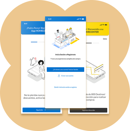
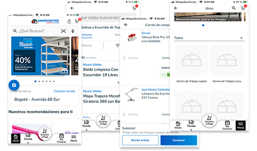
- Optimized purchase and return flows to eliminate friction and ensure a high-conversion e-commerce experience.
- Directed visual conceptualization using strategic moodboards to align brand identity with user expectations.
- Architected a scalable design system with advanced tokenization as a unified source of truth for the ecosystem.
- Led the implementation of accessibility guidelines to ensure WCAG compliance and inclusive experiences.
- Integrated strategic motion design to simplify complex interactions and provide intuitive visual cues.
- Mentored the UX/UI team to foster a collaborative culture focused on delivering high-impact solutions.
The problem
- The old app was slow and crashed often, making it very frustrating for the customers.
- Outdated technology made it impossible to add new features and caused a drop in sales.
- The app did not meet accessibility standards, making it difficult for many people to use it.
- Fixing these issues was a top priority to keep the platform secure and protect the brand.
1. Understanding
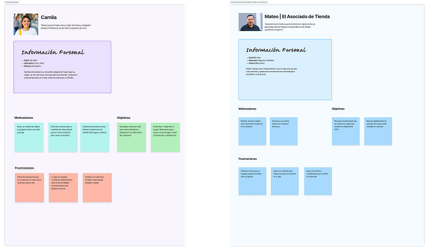
A. User personas
Defined the two type of users persona to align the solution functionalities with the business objectives.
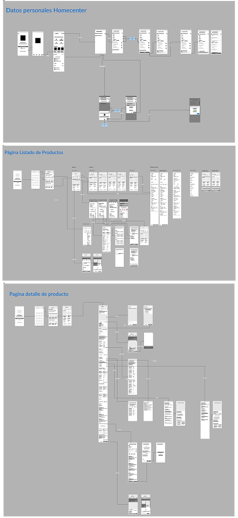
B. From logic to layout
Understood how the whole app is made in terms of information architecture and building the Structure: Testing layouts before final design.
Flows
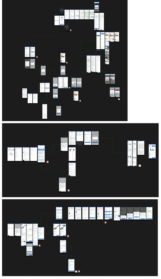
Wireframes
C. Research
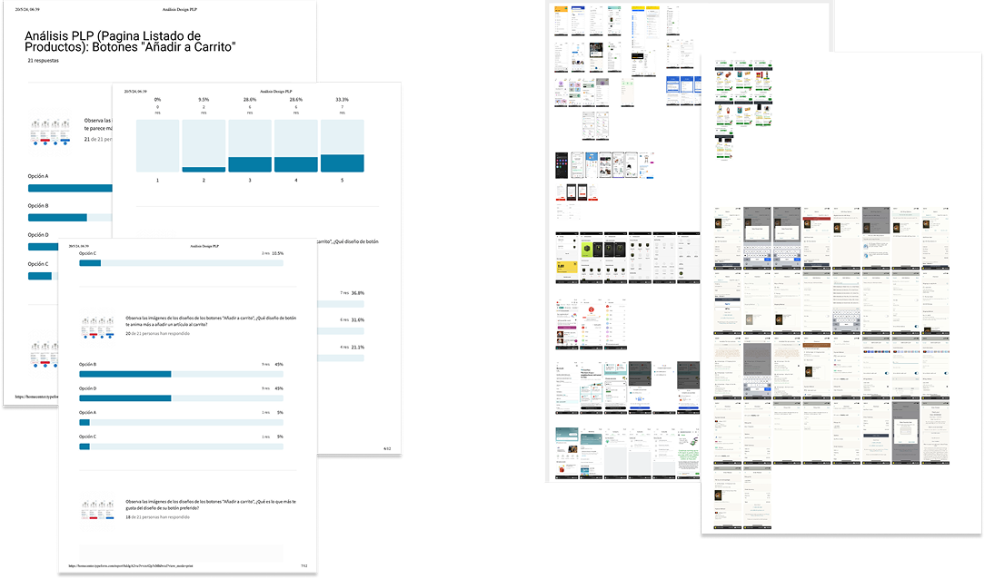
- Used A/B testing to validate and optimize the purchase and return flows based on real user behavior.
- Ran surveys to determine the most effective look and feel for key elements like the 'Add to Cart' button.
- Visual Conceptualization & Moodboards.
2. Hi-Fi Prototype
Solution
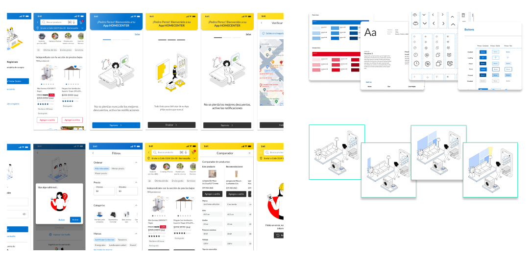
- Delivered a total redesign of the app to fix major problems, not just change colors.
- Created a clean interface that makes it easy for customers to buy and return items.
- Improved font sizes and color contrast to make the app accessible for every user.
- Built a scalable design system with advanced tokenization for a unified source of truth.
- Integrated strategic motion design to simplify complex interactions and provide intuitive visual cues.
Challenge
Balancing stakeholder expectations with real user needs while coordinating design, engineering, and product teams across multiple countries was one of the biggest challenges. I had to ensure every decision was data-driven yet flexible enough to adapt to market differences.
Impact
The redesigned Homecenter app dramatically improved user satisfaction and business performance. Post-launch metrics showed increased conversion rates, reduced cart abandonment, higher NPS scores, and significantly fewer support tickets. The new design system also reduced design-to-development handoff time by over 40%.
Learnings
I learned that true user-centered design means constantly questioning assumptions. Data and research should always drive decisions, but empathy and storytelling are what make those insights actionable across teams. Building trust with engineering and stakeholders is just as important as building trust with users.